Heading Hierarchy Guide for Squarespace
This post contains affiliate links. If you purchase through them, I may receive a small commission at no extra cost to you.
Table of Contents Show
A lot of Squarespace templates are designed to look gorgeous. And they DO look great! But aesthetics aren't everything when it comes to building a website that works for your visitors and performs well in search.
I see this all the time with clients: they pick a beautiful template, add their content, and hit publish without ever thinking about their heading structure.
And honestly? I don't blame them. Heading hierarchy isn't exactly the sexiest topic in web design.
But here's why it's worth those few extra minutes to get it right:
For SEO: Search engines use your headings to understand what your page is about. A clear heading structure helps Google (and other search engines) figure out your content hierarchy and can give your SEO a real boost.
For Accessibility: Blind and low vision people typically use a screen reader to audibly announce the contents of a webpage. Screen reader users can quickly navigate by jumping to different heading levels using keyboard commands — like "read all the H2 elements on this page" or "jump to the next H3 element." This makes proper heading structure essential.
For User Experience: Clear headings help ALL visitors scan your content quickly and find what they're looking for. We all skim online, right? Good headings make that possible.
So let's dive into how to actually set this up in Squarespace.
Pin it for later: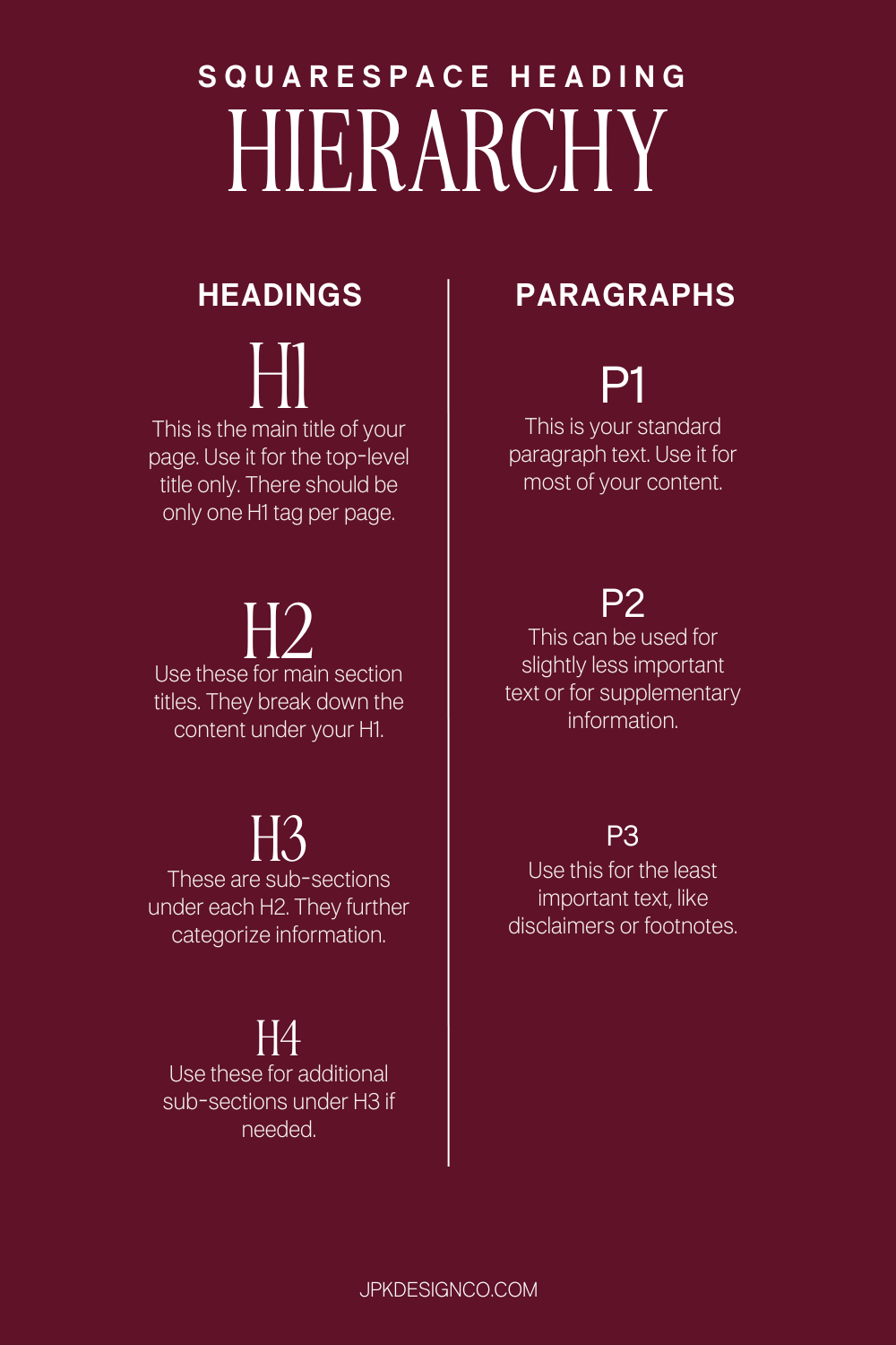
The Basics: Understanding Squarespace’s Heading Tags
Think of your heading structure like an outline you'd write for a paper or presentation. There's a clear hierarchy from most important to least important.
Heading Tags (H1-H4)
H1: Your Page Title
This is the main title of your page: the big idea. There should be only ONE H1 tag per page. Think of it as the title of a book chapter. In Squarespace, this is usually your page title or the main headline at the top of your page.
H2: Main Section Titles
These are your major sections that break down the content under your H1. They're like the main points in your outline.
H3: Subsections Under Each H2
These further categorize information within each main section. You might not need H3s on every page, and that's totally fine.
H4: Additional Subsections (If/as Needed)
Use these for even more detailed breakdowns under your H3s. Some pages won't need to go this deep, but they're there when you do. I use H4s in blog posts more than anywhere else.
The key thing to remember: Try not to skip levels. You shouldn't jump from H1 to H3 without an H2 in between. It confuses both search engines and screen readers.
Paragraph Styles (P1-P3)
Squarespace also gives you paragraph style options, which are separate from your heading tags. Unlike heading tags, which have semantic meaning for search engines and screen readers, paragraph styles are purely visual; screen readers simply read them as regular paragraph text
P1: Larger Emphasis Text
Use this for text that should look bigger and more important than your regular body copy — things like introductory paragraphs, pull quotes, or anything you want readers to notice first. Just remember that to screen readers, it's still a regular paragraph (not a heading).
P2: Standard Body Text
This is your default paragraph text in Squarespace. Use it for the bulk of your content; the main body copy of what you're saying. When you add a text block, it defaults to P2.
P3: Tertiary Text
This works great for disclaimers, footnotes, image captions, or the least important text on your page.
Miscellaneous/Monospace
There's also a "Miscellaneous" font setting in Squarespace (Design → Site Styles → Miscellaneous) that you can access by applying the "Monospace" format to text. Some designers use this as a third font option for things like intro text or pull quotes.
Like the other paragraph styles, it's purely visual; screen readers treat it the same as regular paragraph text. It doesn't affect your heading hierarchy or SEO.
Common Heading Hierarchy Mistakes (And How to Fix Them)
Mistake #1: Using Headings for Style Instead of Structure
I get it — H1 might look better on your page than H3. But if it's actually the header, it needs to be the H1 regardless of how it looks.
But the good news is, you can always customize the styling of your headings in Squarespace's design settings to make them look exactly how you want.
The Fix: Choose your heading level based on content hierarchy first, then adjust the visual styling in your site styles.
Mistake #2: Multiple H1s on One Page
Some Most of Squarespace’s built-in free templates (especially older ones) might have multiple H1 tags scattered throughout a page. This both dilutes the SEO value and confuses screen readers about what your page is actually about.
The Fix: Go through your template and make sure you have just one H1 per page; your main page title/idea.
Mistake #3: Skipping Heading Levels
Going from H1 straight to H3, or H2 to H4, creates gaps in your content structure.
The Fix: Always use headings in order. If you have an H3, there should be an H2 above it. If you have an H4, there should be an H3 above it.
Mistake #4: Not Using Headings at All
Sometimes people will just make text bigger and bold instead of using actual heading tags. This looks fine visually but does nothing for SEO or accessibility.
The Fix: Use the actual heading options in Squarespace's text editor, not just formatting.
How to Check and Fix Your Heading Hierarchy in Squarespace
Here's the step-by-step process I use (and recommend to all my clients):
Step 1: Audit Your Current Structure
Go through each page of your site and look at what heading levels you're using. You can do this by clicking into each text block and checking the dropdown in the text editor.
Alternatively, you can use a browser extension like HeadingsMap or SEO Meta in One Click to see your entire heading structure at a glance. This is a helpful little cheat code and makes the process SO much faster.
If you want a more comprehensive SEO tool that also checks your heading structure along with a bunch of other SEO elements, SEOSpace is built specifically for Squarespace and makes it easy to audit and maintain your entire website.
Step 2: Fix Your H1
Make sure each page has exactly one H1, and that it's your main page title or headline. This should be the MOST important piece of information on the page.
Step 3: Organize Your H2s
Look at your main sections and make sure they're all H2s. These should be the big topics or categories on your page.
Step 4: Add H3s (and H4s) Where Needed
If you have subsections under your H2s, those should be H3s. If you need to go deeper, use H4s. But remember that not every page needs to go this deep. A simple Contact page might only need an H1 and a couple of H2s, and that's perfectly fine.
Step 5: Style to Match Your Brand
Once your structure is correct, head to your Squarespace design settings (Design → Site Styles) and customize how each heading level looks. You can adjust font, size, color, spacing, whatever you need to make it look exactly how you want while maintaining proper structure.
Accessibility: Heading Hierarchy Beyond SEO
I mentioned this earlier, but it's worth explaining in more detail. According to the WHO, over 2.2 billion people worldwide have some form of vision impairment.
Many of these folks use screen readers to navigate the web.
The best practice for headings is to "nest" your content in a logical hierarchy. When you nest headings in the right way, screen reader users can use keyboard commands to navigate efficiently. For example, they can tell their screen reader to "read all the H2 elements on this page" to get an overview, or "jump to the next H3 element" to move through subsections.
Think of it like organizing produce at a grocery store:
H1: Produce
H2: Fruit
H3: Berries
H4: Strawberries
H4: Blueberries
H3: Citrus
H4: Oranges
H4: Lemons
H2: Vegetables
H3: Leafy Greens
H4: Spinach
H4: Kale
H3: Root Vegetables
H4: Carrots
H4: Beets
This nesting makes sense logically. You have the main category (Produce), then major sections (Fruit and Vegetables), then subcategories (Berries, Citrus, Leafy Greens, Root Vegetables), and finally specific items (Strawberries, Oranges, Spinach, Carrots). Each level gets more specific.
Anything other than well-structured, nested content can be disorienting when using a screen reader. Without clear headings, someone using a screen reader has to listen to your entire page from top to bottom with no way to skip ahead. Imagine having to listen to a 2,000-word blog post read aloud with no way to jump to the section you need.
Plus, proper accessibility isn't just the right thing to do — it's increasingly becoming a legal requirement in many places. The Web Content Accessibility Guidelines (WCAG) are now referenced in laws around the world, including the ADA in the US.
Quick Reference Guide
Use only one H1 per page: this is your main page title
Structure your content using H2, H3, and H4 to create a clear, logical flow
Don't skip heading levels: always use them in order (H1 → H2 → H3 → H4)
Choose headings based on structure, not style: you can customize how they look later
Use P2 for your main body text: it's the default paragraph style in Squarespace
Use P1 for emphasis text like intro paragraphs or pull quotes, and P3 for smaller text like captions
Check your work with free tools like HeadingsMap or SEO in 1 Click or with a subscription to SEOSpace to see and audit your structure
Remember accessibility: proper headings help screen reader users navigate your site
I know heading hierarchy isn't the most exciting part of building your website.
But it's one of those things that takes just a few minutes to set up correctly and pays off in both SEO and accessibility considerations for months and years to come.
Better SEO means more people finding your site. Better accessibility means everyone can use your site. Better user experience means visitors can actually find what they're looking for.
So next time you're working on a page in Squarespace, whether you're starting from a template or building from scratch, take those few extra minutes to get your headings right.