Squarespace Hacks That Make Small Business Websites Look Like a Billion Bucks
Table of Contents Show
This post contains affiliate links. If you purchase through them, I may receive a small commission at no extra cost to you.
You don't need a Fortune 500 budget to build a website that looks like one.
With a few intentional tweaks, your Squarespace site can feel polished, professional, and like the kind of place people want to hand their money over to.
Why these "small" changes aren't actually smallWebsite visitors aren't sitting there with a clipboard, consciously tallying up your design sins.
They're not thinking "hmm, the fonts don't match" or "that spacing feels off."
They're just getting a gut feeling. A vibe. A quick internal read on whether you seem like the real deal... or not quite.
And that gut feeling forms in seconds.
Professional design tells people: this person pays attention to details, they take their work seriously, they're worth my investment. Amateurish design, even if your services are world-class, makes people quietly wonder if you're cutting corners. Or just starting out. Or both.
When someone lands on a site that feels considered and polished, they're more likely to stick around and read what you wrote, hand over their email address, tell their friends about you, and choose you over the competitor with the messier site.
And none of this requires touching a single line of code (except one optional one I’ll share). Let me show you.
1. Let Your Website Breathe with Strategic White Space
Nothing communicates "I built this myself from ChatGPT tutorials" like a cluttered layout.
White space isn't wasted space. It's what makes everything feel organized, intentional, and easy to absorb. Think about the difference between walking into a beautifully spaced-out boutique versus a discount store where merchandise is crammed into every corner. Same concept.
Try this: In Fluid Engine, click any section and look for the "Fill Screen" toggle. Turn it on, then set the height to "Medium" for some generous breathing room. For spacing between blocks, play with the "Gap" settings: no gap, preset gaps, or custom spacing. That extra room makes your site feel calmer, more professional, and a whole lot easier to read.


2. Keep Alignment Consistent
Misaligned elements are like showing up to an important business meeting with two different socks. Technically you're dressed. But something's off, and people can tell. Consistent alignment feels sharp. Trustworthy. Like someone who has their act together.
Try this: Left-align your body text, especially in longer paragraphs, and snap images and buttons to Squarespace's grid. Keep spacing between blocks consistent so everything feels balanced rather than "kind of thrown together."
And one of my favorite little Squarespace tricks: hit the letter G on your keyboard to show (or hide) the grid overlay while you're editing. Makes lining things up so much easier.


3. Limit Yourself to Just Two or Three Fonts
I know. That fun script font is calling your name for the services section. And that bold display font would look so good on testimonials.
Don't do it.
Too many fonts is instant chaos. It makes your site look like it was designed by a committee. (A very enthusiastic committee… with zero design background.)
Professional sites almost always stick to two or three: one for headings, one for body text, and maybe one accent font if you're feeling disciplined about it.
Try this: In Site Styles, set a serif for headings and a clean sans-serif for body copy. Make sure your H1 is noticeably bigger than your H2, which should be bigger than your H3, and then your H4 because hierarchy matters for design, SEO, and accessibility.
Set your line-height to 1.4 or 1.5 so text is easy to read, keep body text at at least 16px (anything smaller and people are squinting and leaving), and add space between paragraphs so your copy doesn't look like one giant wall of words. For headings, tightening the letter spacing by -0.5px to -1px can make them look noticeably more polished. Worth trying.


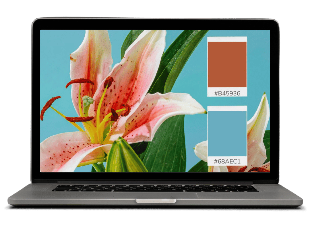
4. Use a Curated Color Palette
Most people launching a Squarespace site just pick one of the preset color themes and call it a day.
Which means their site ends up looking like thousands of other Squarespace sites. And visitors, consciously or not, can tell.
Why You Should Choose a Consistent Color Palette for Your Site
When someone lands on your homepage, clicks over to your services page, then checks out your about page, they should feel like they're moving through one cohesive brand. Not visiting three businesses that happen to share a domain.
Consistent colors build recognition and trust. They make you look intentional rather than indecisive.
Try this: Skip Squarespace's preset themes entirely and create a custom palette that matches your brand. Use tools like Coolors.co (free or paid options), Color Palette Pro (paid), or Huemint (free) to generate accessible and beautiful color combinations that feel uniquely yours. These tools help you find colors that work well together AND ensure good contrast for readability.
Once you have your colors, go to Design → Site Styles → Colors and swap out Squarespace's defaults. Squarespace still handles all the coordination across buttons, backgrounds, and links. It just does it with your colors now.


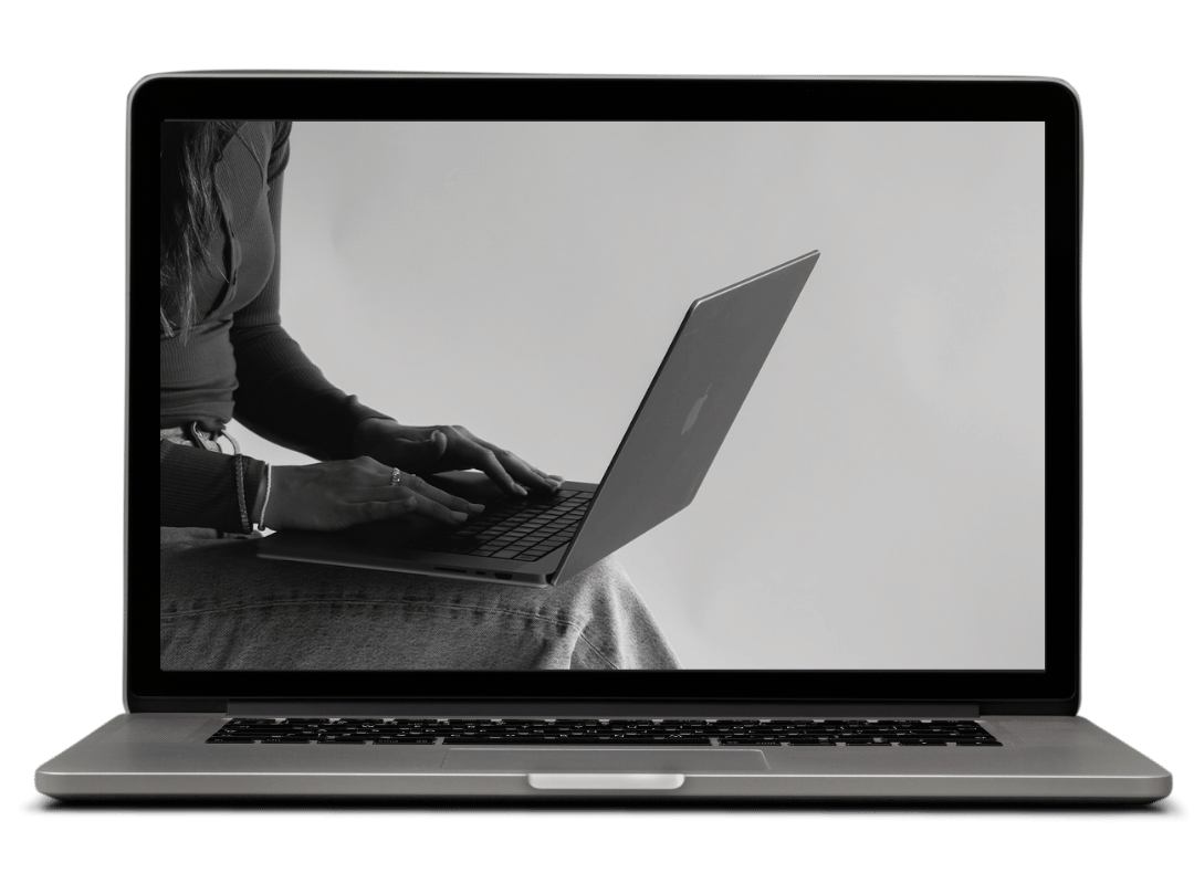
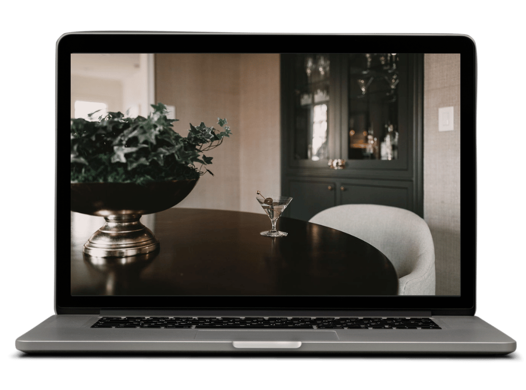
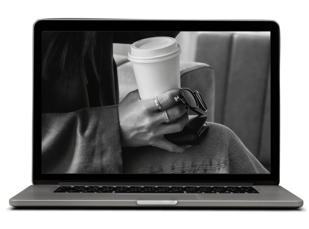
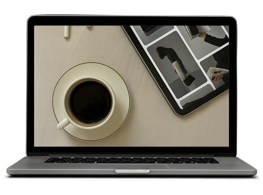
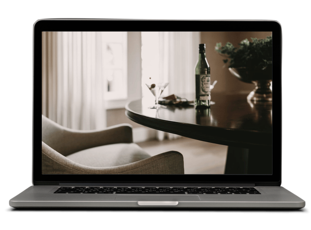
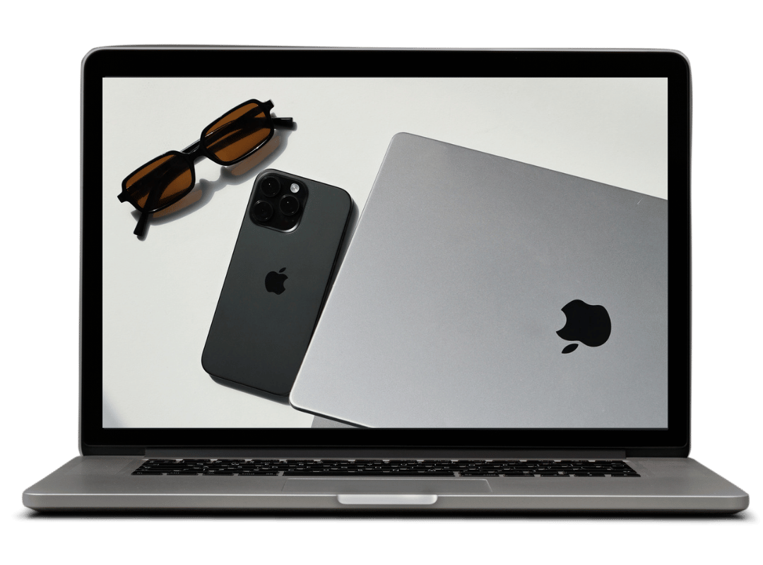
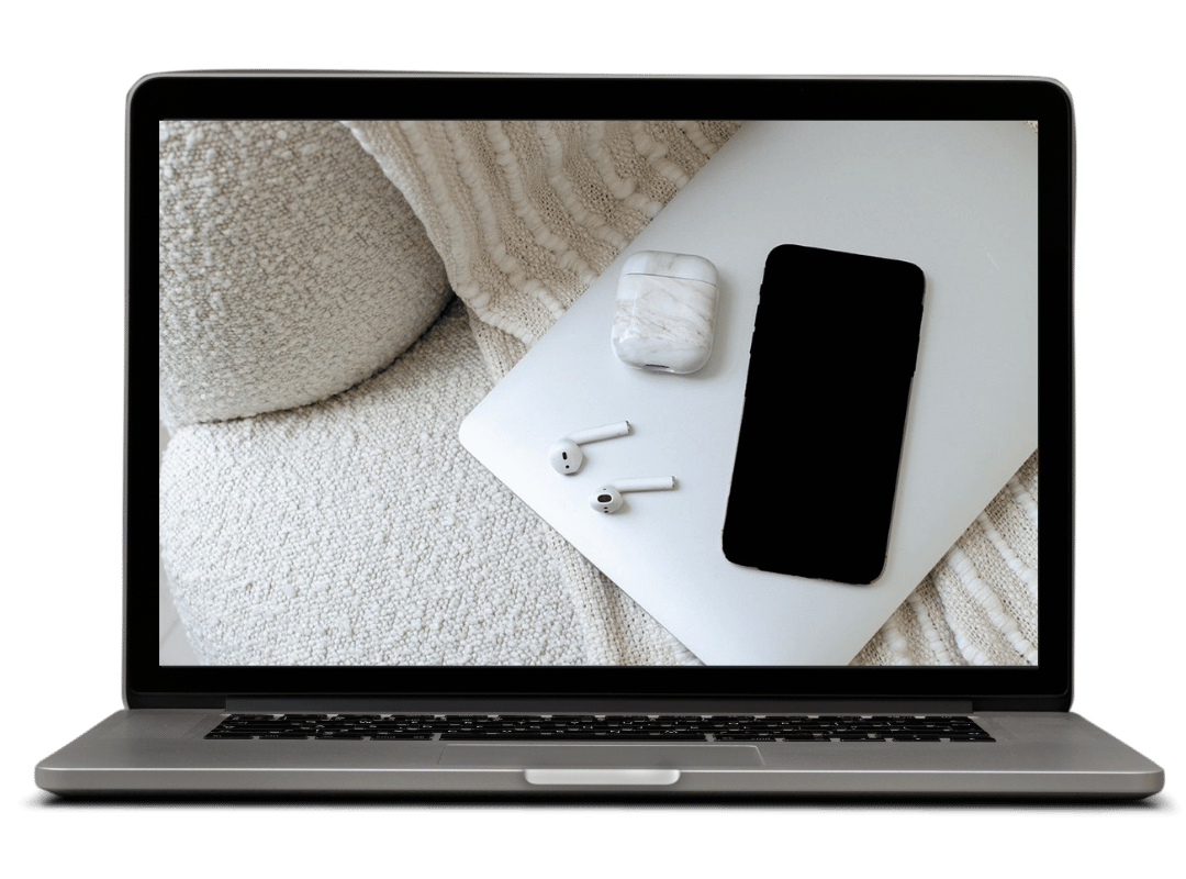
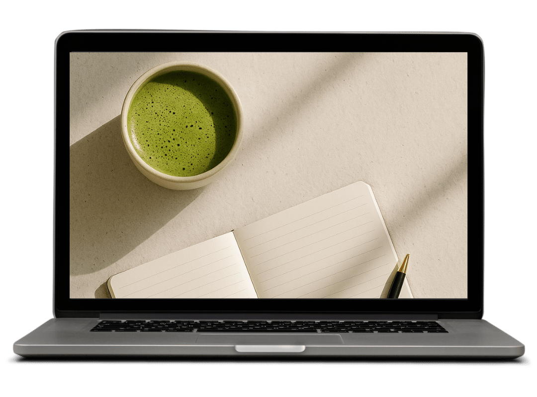
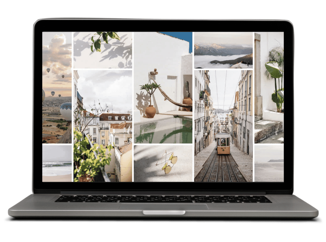
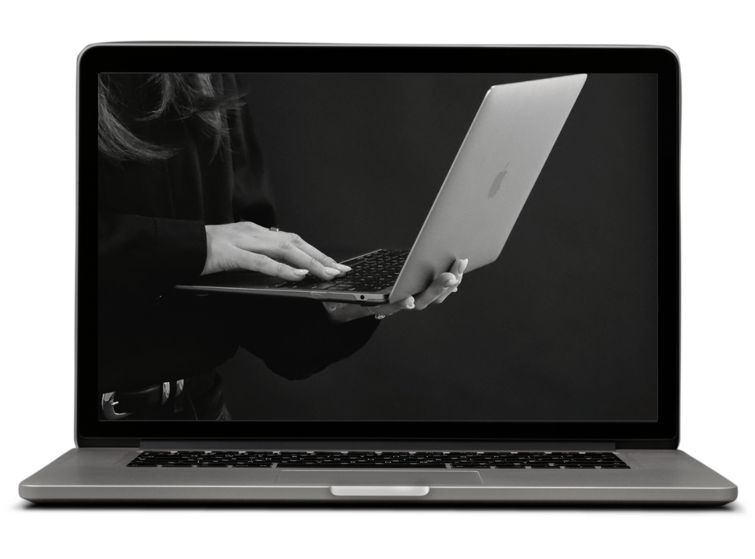
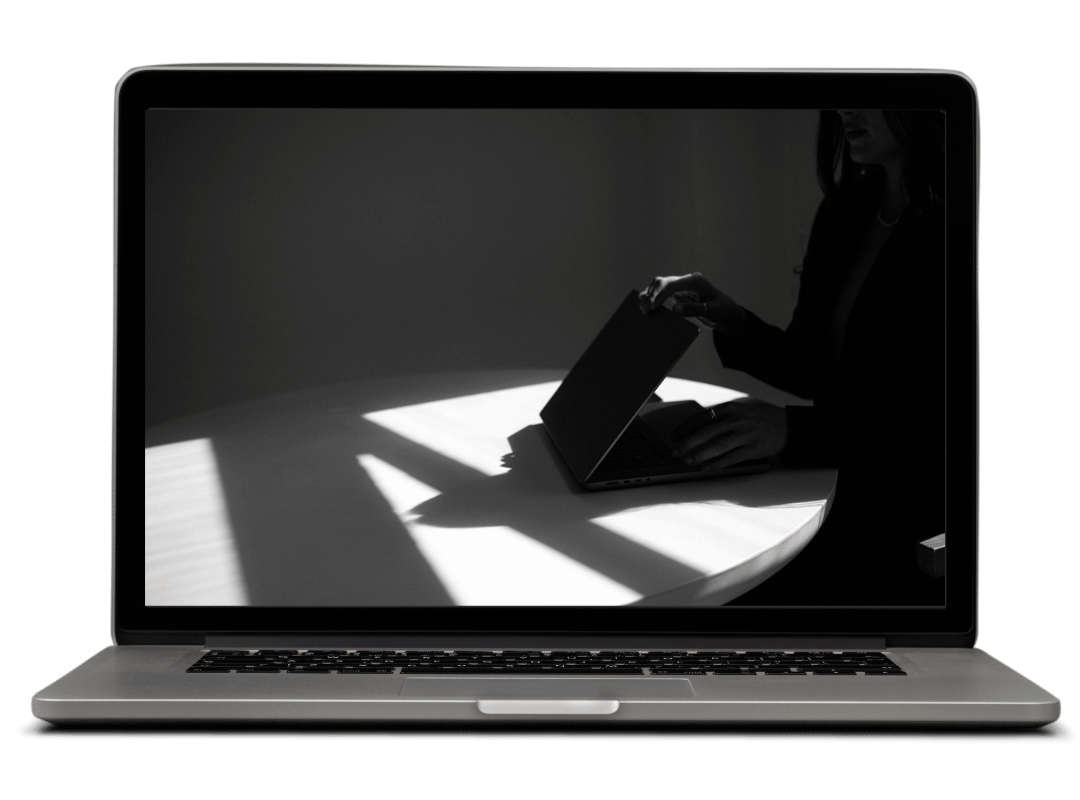
5. Choose High-Quality, On-Brand Images
Generic stock photos are doing more damage than most people realize.
You know the ones: the staged laptop on the bed, the flat lay with the marble background and the gold pen, the woman laughing at a salad. They're telling visitors you didn't put much thought into this, and that's the last impression you want to make.
Try this: Upgrade your image sources. For premium on-brand stock photos, check out Editorial Stock Images (my favorite) Styled Stock Society or Vault Stock. If you're on a budget, both Pexels and Kaboompics has great free options. Dupe Photos is another great free option for stock photos, and leans a little Gen Z vibe.
For sizing: upload images between 1,500 and 2,500 pixels wide (2,500px for full-width banners, 1,500px for regular blocks) and keep file sizes under 500KB, ideally under 250KB, so your site doesn't load like it's 2009. Set focal points in Squarespace so the most important part of the image stays visible no matter what screen size someone's on.


6. Double-Check the Mobile Experience
About 60% of global web traffic comes from mobile. Most of the people landing on your site right now are looking at it on their phone, and the site you've been tweaking on your desktop can look completely different on a 6-inch screen.
Try this: Preview every page in mobile view. If your headlines look massive or your text feels cramped, add this CSS under Design → Custom CSS:
@media screen and (max-width: 640px) {
  h1 { font-size: 28px; line-height: 1.3; }
}


Building a polished website isn't about having a big budget or knowing how to code. It's about being consistent, intentional, and caring enough to sweat the details your visitors can't quite name but absolutely feel.
Apply these tweaks today and your site will start looking a lot more like "established business I want to work with" and a lot less like "side project I'm still figuring out."