9 Stunning Color Palettes For Your Squarespace Website
Table of Contents Show
Picking the right color palette for your website feels like one of those decisions that could make or break your entire brand. Or else it’ll take too long to wade through all the options.
The right colors don't just make your site pretty (though that's nice too). They create that instant vibe that your ideal client just ‘gets’ when they land on your homepage.
Why Your Color Palette Matters More Than You Might Think
Your website colors are doing way more work than just looking fine. They're:
Setting expectations before anyone reads a single word. Walk into a spa with neon yellow walls, and you're immediately wondering if you'll even leave feeling relaxed. Same goes for your website.
Making it easier (or harder) for people to take action. Ever tried to find the "buy now" button on a site where everything blends together? Frustrating, right?
Creating that memorable first impression that has the right people thinking "I need to work with this person" instead of clicking the back button.

9 Color Palettes (That You Can Totally Steal)
Ready for some color palette inspo? Here are nine color combinations that look professional, feel intentional, and work beautifully in Squarespace.
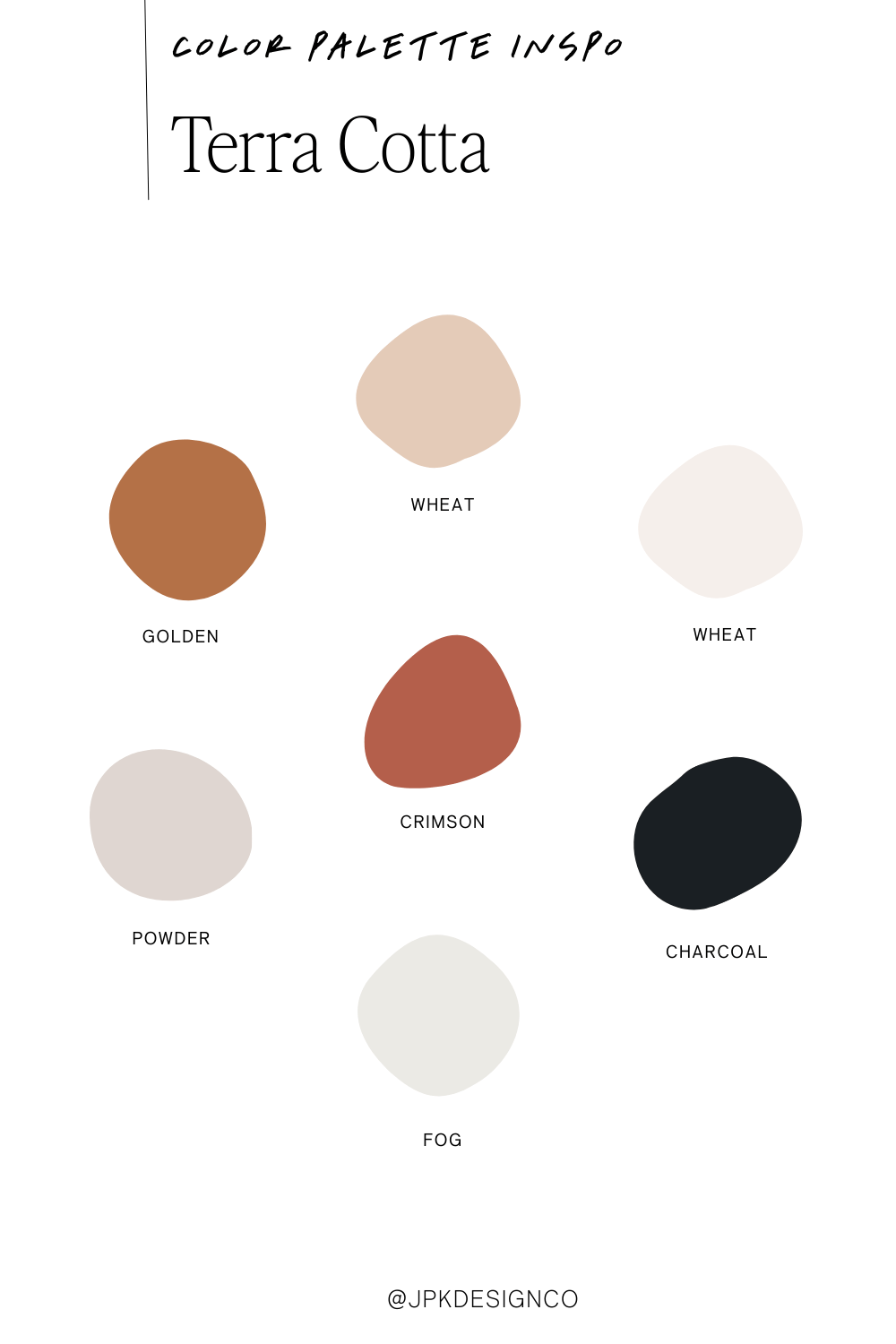
1. Terra Cotta
Perfect for: Interior designers, lifestyle coaches, wellness practitioners
Warm golden browns meet soft wheat tones, with rich crimson accents and sophisticated charcoal grounding everything. It's like wrapping your website visitors in a cozy cashmere blanket—instantly welcoming without being overwhelming.
The vibe: Grounded, sophisticated, approachable
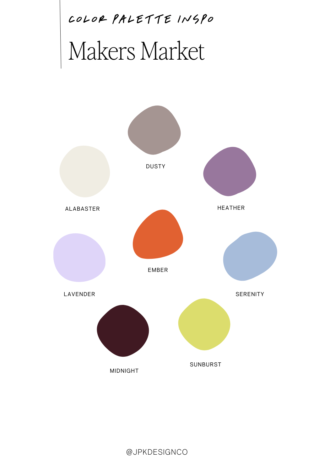
2. Makers Market
Perfect for: Creative entrepreneurs, artisans, handmade businesses
Soft alabaster whites blend with dusty taupe, vibrant heather purple, gentle lavender, rich ember orange, calming serenity blue, deep midnight, and cheerful sunburst yellow. This palette feels like browsing a curated craft fair.
The vibe: Artisanal, creative, authentic
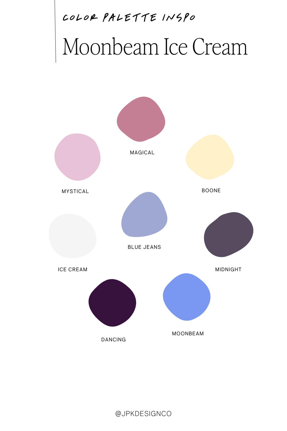
3. Moonbeam Ice Cream
Perfect for: Creative agencies, photographers, modern service providers, ice cream trucks 😉
Think soft mystical pinks, magical mauves, gentle blue jeans, ice cream whites, and deep midnight purples. This palette whispers "creative professional" without screaming "I'm trying too hard to be artistic."
The vibe: Creative, dreamy, professional with a twist
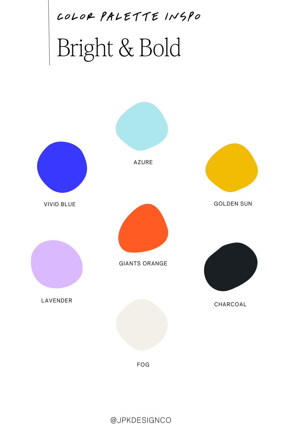
4. Bright & Bold
Perfect for: Tech startups, creative agencies, bold & fun brands
Electric vivid blue meets soft azure, sunny golden yellows, vibrant giants orange, soft lavender, and grounded charcoal with crisp fog white. When you want to make a statement that can't be ignored.
The vibe: Energetic, confident, creative, innovative
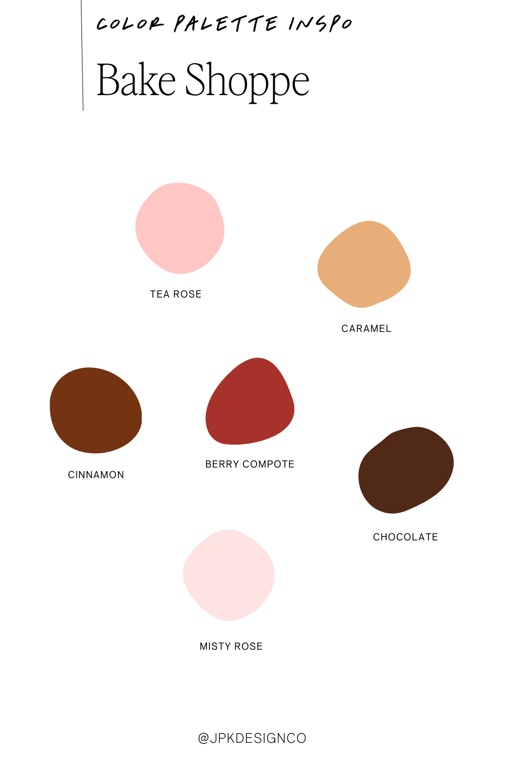
5. Bake Shoppe
Perfect for: Bakeries, warm & welcoming coaches, copywriters
Soft tea rose pink pairs with warm caramel, rich cinnamon brown, berry compote red, deep chocolate, and gentle misty rose. It's like the visual equivalent of walking into your favorite neighborhood bakery. Think cinnamon roll, chocolate croissant, hot cocoa.
The vibe: Warm, inviting, comforting
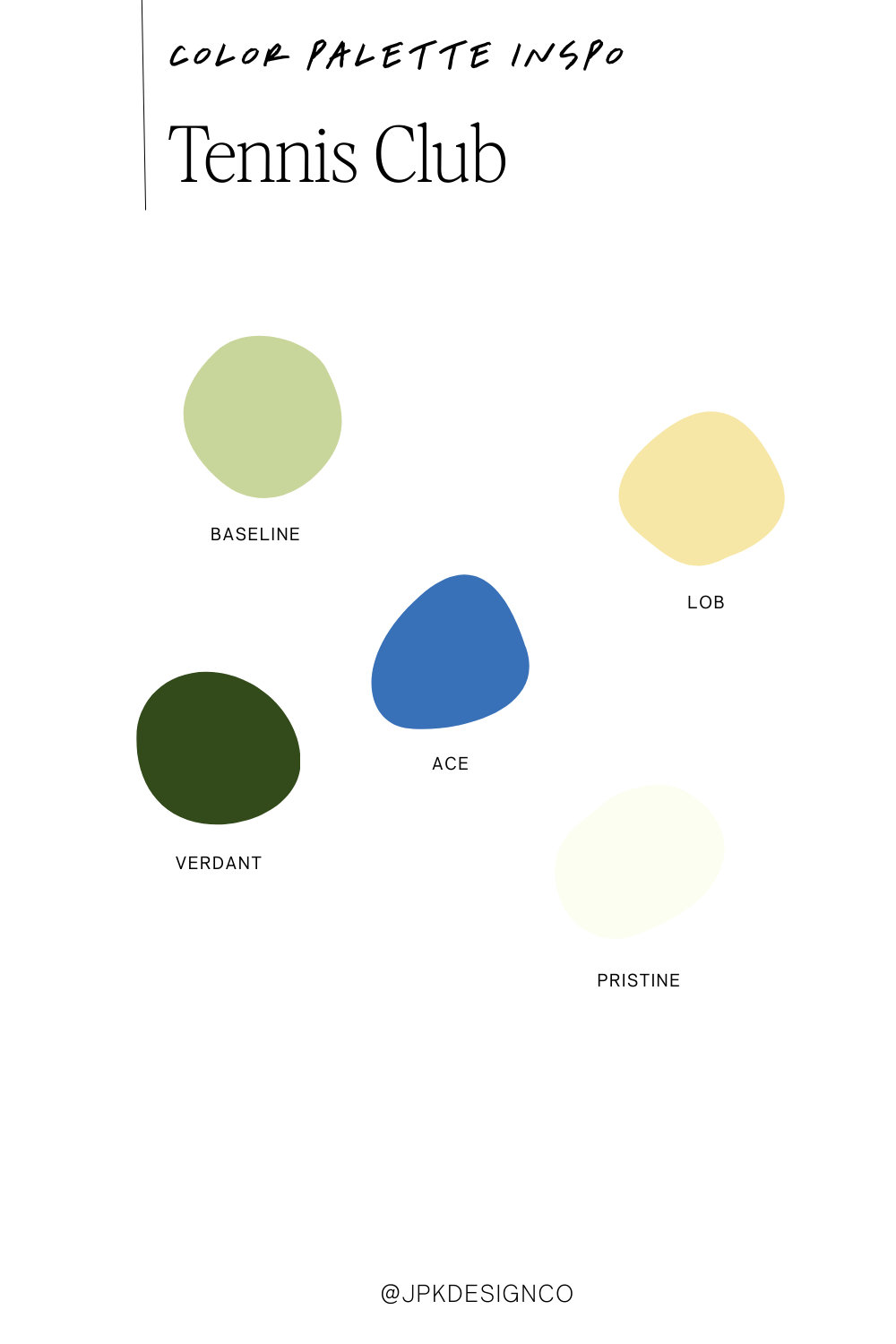
6. Tennis Club
Perfect for: Consultants, financial services, food brands
Clean baseline sage green, sunny lob yellow, classic ace blue, rich verdant green, and crisp pristine white. It's preppy without being stuffy, classic without being boring.
The vibe: Trustworthy, effortlessly elegant, and a little fun.

7. Matcha Lemonade
Perfect for: Health coaches, graphic designers, fresh food brands
Bright pastel yellow meets cool mint green, with rich grass tones and energetic orange. This combination feels like a farmers market on a perfect spring morning.
TIP: If you need another color to use in Squarespace, use one of these twice, or pull in a bright white or almost black.
The vibe: Fresh, energetic, health-conscious
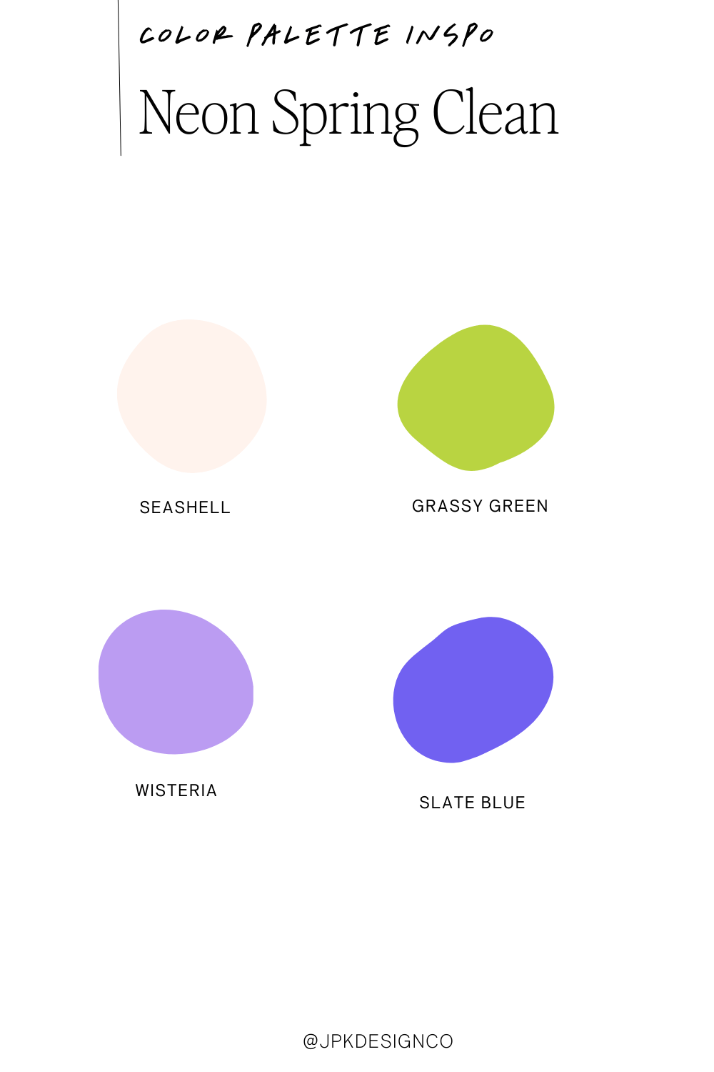
8. Neon Spring Clean
Perfect for: Modern businesses, minimalist brands, fresh starts
Soft seashell pink, vibrant grassy green, gentle wisteria purple, and bold slate blue. Like giving your brand a breath of fresh air.
TIP: If you need another color to use in Squarespace, use one of these twice, or pull in a bright white or almost black.
The vibe: Clean, modern, refreshing
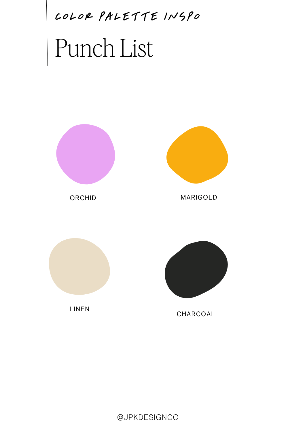
9. Punch List
Perfect for: Bold brands, creative services, statement makers
Vibrant orchid purple meets warm marigold orange, grounded by soft linen beige and sophisticated charcoal. When you want your brand to pack a punch.
TIP: If you need another color to use in Squarespace, use one of these twice, or pull in a bright white or almost black.
The vibe: Bold, confident, memorable
How to Use These Colors in Squarespace
Found a palette you wanna steal? First, go right ahead. Second, here's how to make it work on your own site:
Start with your background. Usually your lightest color becomes your main background.
Pick your star player for buttons and links. This should be your most vibrant or contrasting color - you’ll use this on buttons and for highlighting the important bits.
Use your darkest shade for main text. Please don’t choose terrible combos like light gray text on a white background.
Save your accent colors for headings and special elements. These are like accessories; they should enhance, not overwhelm.
Pssst - Need to grab the hex codes of your favorite palette? Use the ColorZilla eyedropper chrome extension to easily select any of these color codes. It’s free and takes about 2 seconds to install.