13 Underrated Google Font Pairings (for When You're Bored of the Usual Suspects)
Table of Contents Show
Finally, some Google font combos that won't make you yawn.
When you're designing a website, there's a lot to consider. Images, colors, your logo.
But one thing that often gets overlooked is fonts.
Fonts affect how people see your brand, whether they can actually read your copy, and if they stick around or click away because something feels off.
What are font pairings?
Font pairings involve combining two fonts to create visual harmony and contrast. Generally, one font serves as the headline font, while another complements it for body copy. Sometimes you'll add a third for buttons or quotes.
The best font pairings work well together, but have enough variation to add contrast and draw the reader's eyes to important areas of what they’re reading (like a website).
What’s the difference between Serif vs. sans-serif?
Serif fonts have little lines or strokes at the ends of letters (like Times New Roman). Sans-serif fonts don't have these lines - they're clean and simple (like Arial). Serifs often feel more traditional and formal, while sans-serifs feel more modern and casual and are generally easier to read.
What are Google Fonts?
Google Fonts is a library of more than a thousand fonts that are completely free for anyone to use for any purpose. The fonts are also optimized for the web, which keeps your page load times fast.
And how do you choose font pairs?
Here are a few tips:Choose fonts that are different, but not too different
When in doubt, combine a serif with a sans-serif font
Consider legibility - make sure both fonts are easy to read
Consider your brand - different fonts evoke different emotions
Trust your gut - if a pairing feels right, it probably is
Here are 13 slightly more unexpected - or just not as frequently used - font pairings will give your website personality while staying readable and professional.
01. Alegreya Sans + Alegreya
Headline Font: Alegreya Sans
Body Font: Alegreya
Clean headers meet bookish charm
Both fonts come from the same designer, so they're natural companions. Alegreya Sans has a tall x-height and open letterforms that make it super readable on screens. The serif version was specifically designed for books, with flowing curves that make long reading comfortable. A detail I love is how both fonts have slight irregularities - like the lowercase 'g' has this organic tail that feels more hand-drawn than mechanical.
Think: Wine shop, bookkeeping service, estate sale organizer, antique furniture dealer, cozy bed & breakfast.
Jumpy zebras fix quirky boxes while sipping decaf lattes at midnight. The vibe is cozy, but the alphabet’s all here—jumbled in like it belongs.
From quick brown foxes to lazy dogs, from zigzags to whispering willows, every letter gets a turn. Punctuation wanders in too: commas, periods, apostrophes, maybe even a semicolon if it feels brave. This paragraph isn't trying to say something profound—it’s just here to help your fonts stretch out, breathe, and show their personality. Because every pixel matters when you're picking your partners in type.
Or if you prefer, you can reverse it, and use the lovely bookish Alegreya as the header and Alegreya Sans as the body:
Jumpy zebras fix quirky boxes while sipping decaf lattes at midnight. The vibe is cozy, but the alphabet’s all here—jumbled in like it belongs.
From quick brown foxes to lazy dogs, from zigzags to whispering willows, every letter gets a turn. Punctuation wanders in too: commas, periods, apostrophes, maybe even a semicolon if it feels brave. This paragraph isn't trying to say something profound—it’s just here to help your fonts stretch out, breathe, and show their personality. Because every pixel matters when you're picking your partners in type.
02. Bricolage Grotesque + Inter
Headline Font: Bricolage Grotesque
Body Font: Inter
Quirky personality meets tech precision
Bricolage Grotesque is delightfully weird in the best way. It has this organic, almost wonky quality with a hook-shaped 'f' that immediately catches your eye. Inter brings the technical reliability; it's geometric, clean, and performs beautifully across all screens: desktop, mobile and tablet. The contrast works because Bricolage brings the character while Inter handles the heavy lifting of readability.
Think: Pottery studio, artisan coffee roaster, vintage clothing boutique, custom tattoo parlor, indie record store.
Jumpy zebras fix quirky boxes while sipping decaf lattes at midnight. The vibe is cozy, but the alphabet’s all here—jumbled in like it belongs.
From quick brown foxes to lazy dogs, from zigzags to whispering willows, every letter gets a turn. Punctuation wanders in too: commas, periods, apostrophes, maybe even a semicolon if it feels brave. This paragraph isn't trying to say something profound—it’s just here to help your fonts stretch out, breathe, and show their personality. Because every pixel matters when you're picking your partners in type.
03. JetBrains Mono + Work Sans
Headline Font: JetBrains Mono
Body Font: Work Sans
Code editor vibes with friendly readability
JetBrains Mono says "I write code" but in a approachable way. The zero has a dot inside to distinguish it from the letter O, and the italic angle is gentler than most monospace fonts to reduce eye strain. Work Sans is based on old grotesque fonts but optimized for modern screens. Together they feel kinda like a tech startup that genuinely cares about user experience.
Think: Arcade bar, retro gaming store, ice cream shop with vintage vibes, record repair service, typewriter restoration.
Jumpy zebras fix quirky boxes while sipping decaf lattes at midnight. The vibe is cozy, but the alphabet’s all here—jumbled in like it belongs.
From quick brown foxes to lazy dogs, from zigzags to whispering willows, every letter gets a turn. Punctuation wanders in too: commas, periods, apostrophes, maybe even a semicolon if it feels brave. This paragraph isn't trying to say something profound—it’s just here to help your fonts stretch out, breathe, and show their personality. Because every pixel matters when you're picking your partners in type.
04. Space Mono + Space Grotesque
Headline Font: Space Mono
Body Font: Space Grotesque
Sci-fi nostalgia with geometric precision
Space Mono, designed by Google, is intended to look like interfaces in science fiction movies - all geometric shapes and perfectly round O's. It has this retro-futuristic quality that's both nostalgic and forward-looking. Space Grotesque shares the same geometric DNA but with proportional spacing. They feel like they belong in the same sleek, minimalist universe.
Think: Craft brewery, furniture restoration, specialty bookbinding, custom framing shop, artisan woodworker.
Jumpy zebras fix quirky boxes while sipping decaf lattes at midnight. The vibe is cozy, but the alphabet’s all here—jumbled in like it belongs.
From quick brown foxes to lazy dogs, from zigzags to whispering willows, every letter gets a turn. Punctuation wanders in too: commas, periods, apostrophes, maybe even a semicolon if it feels brave. This paragraph isn't trying to say something profound—it’s just here to help your fonts stretch out, breathe, and show their personality. Because every pixel matters when you're picking your partners in type.
05. Libre Baskerville + DM Sans
Headline Font: Libre Baskerville
Body Font: DM Sans
Magazine elegance with digital smarts
Libre Baskerville has that crisp, editorial quality you see in sleek, bougie magazines. The serifs are refined but not stuffy. DM Sans was built for the web with optical sizing that automatically adjusts based on how big or small you set it. This pairing says "we take content seriously"… but without feeling too academic or intimidating.
Think: Recipe developer, life coach, nutritionist, freelance writer, personal financial advisor.
Jumpy zebras fix quirky boxes while sipping decaf lattes at midnight. The vibe is cozy, but the alphabet’s all here—jumbled in like it belongs.
From quick brown foxes to lazy dogs, from zigzags to whispering willows, every letter gets a turn. Punctuation wanders in too: commas, periods, apostrophes, maybe even a semicolon if it feels brave. This paragraph isn't trying to say something profound—it’s just here to help your fonts stretch out, breathe, and show their personality. Because every pixel matters when you're picking your partners in type.
06. Libre Baskerville + IBM Plex Sans
Headline Font: Libre Baskerville
Body Font: IBM Plex Sans
Editorial authority with corporate confidence
Same sophisticated headlines as above, but IBM Plex Sans brings more structured, business-focused energy. Plex has this systematic quality - it was designed as part of IBM's entire visual language. The combination feels established and trustworthy, like a company that's been around long enough to know what they're doing.
Think: Insurance agent, tax preparer, real estate broker, financial planner, business consultant.
Jumpy zebras fix quirky boxes while sipping decaf lattes at midnight. The vibe is cozy, but the alphabet’s all here—jumbled in like it belongs.
From quick brown foxes to lazy dogs, from zigzags to whispering willows, every letter gets a turn. Punctuation wanders in too: commas, periods, apostrophes, maybe even a semicolon if it feels brave. This paragraph isn't trying to say something profound—it’s just here to help your fonts stretch out, breathe, and show their personality. Because every pixel matters when you're picking your partners in type.
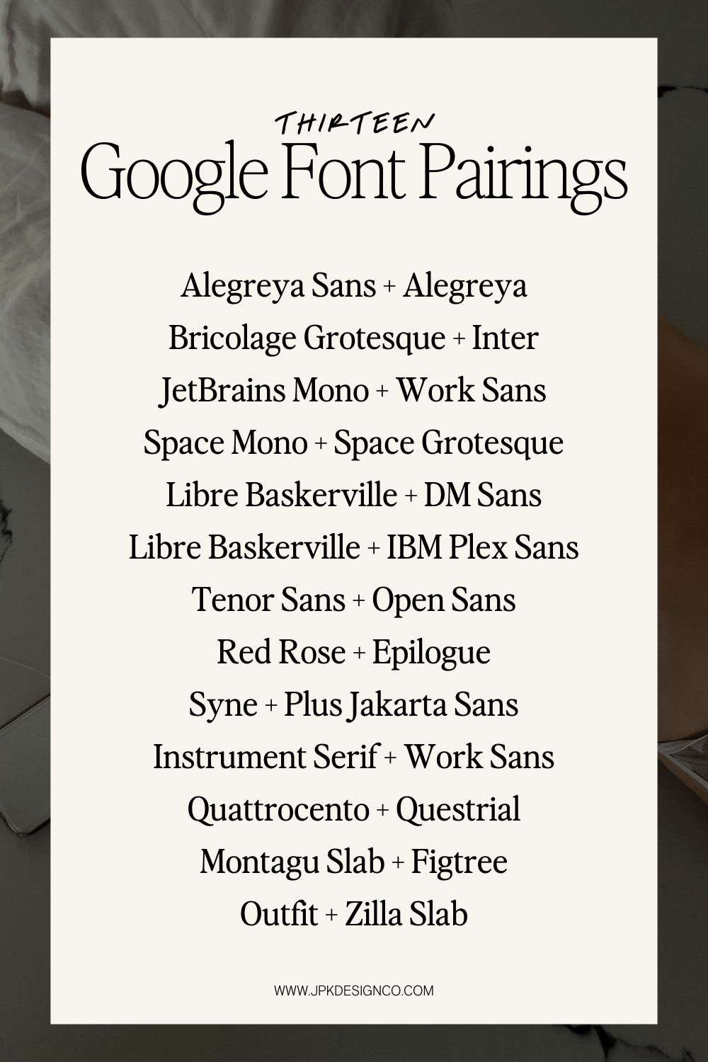
07. Tenor Sans + Open Sans
Headline Font: Tenor Sans
Body Font: Open Sans
Space-efficient style with ultimate readability
One of my favorites. Tenor Sans is elegantly condensed, perfect when you need headlines that don't take up much horizontal space but still look sophisticated. I prefer it in all caps, like in the example below. Open Sans is famously one of the most readable fonts on the web - it's been tested extensively and just works everywhere. Clean and professional without any unnecessary flourishes.
Think: Interior designer, massage therapist, house cleaning service, personal shopper, meal prep delivery.
Jumpy zebras fix quirky boxes while sipping decaf lattes at midnight. The vibe is cozy, but the alphabet’s all here—jumbled in like it belongs.
From quick brown foxes to lazy dogs, from zigzags to whispering willows, every letter gets a turn. Punctuation wanders in too: commas, periods, apostrophes, maybe even a semicolon if it feels brave. This paragraph isn't trying to say something profound—it’s just here to help your fonts stretch out, breathe, and show their personality. Because every pixel matters when you're picking your partners in type.
08. Rose Red + Epilogue
Headline Font: Red Rose
Body Font: Epilogue
Romantic drama with contemporary balance
Red Rose was literally designed for romance novel covers and drama posters. It gets more expressive as it gets bolder, with letters that seem to breathe with emotion. Epilogue keeps things grounded with clean, contemporary shapes. Perfect when you want personality and warmth, but still need to look professional.
Think: Wedding planner, florist, bakery specializing in custom cakes, romance book editor, couples therapist.
Jumpy zebras fix quirky boxes while sipping decaf lattes at midnight. The vibe is cozy, but the alphabet’s all here—jumbled in like it belongs.
From quick brown foxes to lazy dogs, from zigzags to whispering willows, every letter gets a turn. Punctuation wanders in too: commas, periods, apostrophes, maybe even a semicolon if it feels brave. This paragraph isn't trying to say something profound—it’s just here to help your fonts stretch out, breathe, and show their personality. Because every pixel matters when you're picking your partners in type.
09. Syne + Plus Jakarta Sans
Headline Font: Syne
Body Font: Plus Jakarta Sans
Playful expansion with geometric calm
Here's what's cool about Syne: the letters actually get wider as they get bolder, not just thicker. So a bold 'o' becomes more of a circle while a light 'o' is more oval. And don’t even get me started on ‘g’. I love this font so much. Then Jakarta Sans provides stable, geometric letterforms with friendly rounded edges. The combo is modern and distinctive without trying too hard.
Think: Children's art therapist, dog trainer, funky food truck, planner, graphic designer
Jumpy zebras fix quirky boxes while sipping decaf lattes at midnight. The vibe is cozy, but the alphabet’s all here—jumbled in like it belongs.
From quick brown foxes to lazy dogs, from zigzags to whispering willows, every letter gets a turn. Punctuation wanders in too: commas, periods, apostrophes, maybe even a semicolon if it feels brave. This paragraph isn't trying to say something profound—it’s just here to help your fonts stretch out, breathe, and show their personality. Because every pixel matters when you're picking your partners in type.
10. Instrument Serif + Work Sans
Headline Font: Instrument Serif
Body Font: Work Sans
Crafted details with approachable clarity
Instrument Serif looks carefully considered - every curve and angle feels intentional rather than default. It has personality without being showy. Work Sans is easy to read, straightforward and friendly… based on classic grotesque fonts but updated for screens. Quality-focused brands that want to feel approachable, not precious.
Think: Custom furniture maker, wedding photographer, handmade soap company, violin teacher, jewelry designer.
Jumpy zebras fix quirky boxes while sipping decaf lattes at midnight. The vibe is cozy, but the alphabet’s all here—jumbled in like it belongs.
From quick brown foxes to lazy dogs, from zigzags to whispering willows, every letter gets a turn. Punctuation wanders in too: commas, periods, apostrophes, maybe even a semicolon if it feels brave. This paragraph isn't trying to say something profound—it’s just here to help your fonts stretch out, breathe, and show their personality. Because every pixel matters when you're picking your partners in type.
11. Quattrocento and Questrial
Headline Font: Quattrocento
Body Font: Questrial
Classical strength with friendly curves
Quattrocento has the strong, confident presence of carved Roman letters - it feels substantial and timeless. Questrial softens things with circular letterforms and open counters that feel modern and welcoming. Another font I love. If I were a font, I might be Questrial. This combo is traditional authority meets contemporary accessibility.
Think: Wine shop owner, upscale restaurant, boutique hotel, art gallery, luxury travel advisor.
Jumpy zebras fix quirky boxes while sipping decaf lattes at midnight. The vibe is cozy, but the alphabet’s all here—jumbled in like it belongs.
From quick brown foxes to lazy dogs, from zigzags to whispering willows, every letter gets a turn. Punctuation wanders in too: commas, periods, apostrophes, maybe even a semicolon if it feels brave. This paragraph isn't trying to say something profound—it’s just here to help your fonts stretch out, breathe, and show their personality. Because every pixel matters when you're picking your partners in type.
12. Montagu Slab + Figtree
Headline Font: Montagu Slab
Body Font: Figtree
Bold confidence with geometric balance
Montagu Slab has these chunky, playful slab serifs that give it serious presence, without being too aggressive. The letters are slightly tall and narrow, creating a kind of upward energy. Figtree is a perfect body font, bringing geometric stability with perfectly balanced proportions. Personable and witty, but still easy to read.
Think: Design agency, Food truck, pet grooming salon, upscale but charming coffee shop, life or career coach.
Jumpy zebras fix quirky boxes while sipping decaf lattes at midnight. The vibe is cozy, but the alphabet’s all here—jumbled in like it belongs.
From quick brown foxes to lazy dogs, from zigzags to whispering willows, every letter gets a turn. Punctuation wanders in too: commas, periods, apostrophes, maybe even a semicolon if it feels brave. This paragraph isn't trying to say something profound—it’s just here to help your fonts stretch out, breathe, and show their personality. Because every pixel matters when you're picking your partners in type.
13. Outfit + Zilla Slab
Headline Font: Outfit
Body Font: Zilla Slab
Contemporary curves with structured confidence
Outfit feels modern and geometric but avoids that cold, mechanical look through subtle curves and slightly flared letter endings. It’s another one that looks great in all caps. Zilla Slab adds weight and structure with confident rectangular serifs that feel both modern and reliable. This font pairing is organized and trustworthy, but without being boring.
Think: Architecture firm, modern furniture store, co-working space, graphic design studio, contemporary art gallery.
Jumpy zebras fix quirky boxes while sipping decaf lattes at midnight. The vibe is cozy, but the alphabet’s all here—jumbled in like it belongs.
From quick brown foxes to lazy dogs, from zigzags to whispering willows, every letter gets a turn. Punctuation wanders in too: commas, periods, apostrophes, maybe even a semicolon if it feels brave. This paragraph isn't trying to say something profound—it’s just here to help your fonts stretch out, breathe, and show their personality. Because every pixel matters when you're picking your partners in type.
How to use these font pairings:
The best font pairing won't save boring content, and the "wrong" fonts won't kill great writing. These combinations are starting points for creating a look & vibe that supports your messaging.
When you're ready:
Test with your actual copy, not just sample text
Check how they look on phones and tablets (here’s a great free Chrome plugin)
Make sure they fit your brand personality
Don't be afraid to adjust font sizes and spacing
For more font pairing inspiration, check out my 18 favorite Squarespace font combinations that you can add to your Squarespace site right now.
Read this article for 63 of my favorite Google Fonts.
Visit the Google Font store to download any of these fonts for free.