
How to Use Color Psychology to Create an On-Brand Website
Color Psychology in Web Design: How to Make Your Site Emotionally Magnetic
YYou know that feeling when you walk into Target for just toothpaste and somehow walk out with a cart full of throw pillows, a new coffee mug, and - wait, how did a waffle maker get in here?
That's not your lack of willpower.
That's color psychology doing exactly what it's designed to do.
The same thing happens on websites every single day. Visitors land on a page and either feel instantly at home (hello, conversion!) or get that weird "something's off" vibe and bounce faster than you can say "waffle maker."
And most of this happens without your visitors even realizing it.
Why Website Colors Matter More Than You Think
Ever notice how meditation apps never use screaming red branding?
Or how luxury brands rarely go with neon yellow or brat girl summer green?
That's not a coincidence.
Colors are basically one of the silent salespeople on your website. They're working 24/7 to guide visitor emotions, build trust, and nudge people toward the actions you want them to take.
A financial advisor using hot pink and lime green? They're probably going to have a harder time convincing people to trust them with retirement savings. Not because there's anything wrong with those colors, but because they don't match what people expect from someone handling their money.
Your website colors need to work with your message, not against it.
Before You Touch That Color Picker: The Strategy Behind Choosing Website Colors
Hold up.
Before you start playing with color palettes like they're a fun new toy, let's get strategic about what your website needs to accomplish.
Here's what I've learned after helping loads of business owners with their websites: the prettiest color palette in the world won't save a website that doesn't understand its purpose.
>> Ask Yourself These Three Critical Q’s:
1) What's your website's main job?
Are you selling products? Booking service calls? Building an email list? Each goal needs different emotional support from your colors.
2) How do you want visitors to feel when they land on your site?
Excited and energized? Calm and reassured? Inspired and motivated? Your color choices should amplify that feeling, not fight against it.
3) What's your brand personality, really?
Skip the generic "professional but approachable" description.
Are you the reliable expert who's been there, done that? The innovative disruptor shaking things up? The warm friend who makes complex things simple?
These answers should drive your color decisions way more than "I love sage green" ever could.
The Inclusive Global Reality Check: How Cultural Color Meanings Can Make or Break Your Website
Colors don't speak the same language everywhere.
In Western cultures, white often represents fresh starts and clean slates.
But in many Asian cultures? It's deeply connected to mourning and loss.
Red might scream "danger!" or "sale alert!" to some visitors, while signaling "good fortune" and "celebration" to others.
This is interesting, I think, but isn’t just a nifty tidbit for your next dinner party.
If you're designing for a global audience (and let's be honest, most online businesses are), these cultural differences can be the difference between connecting with visitors and accidentally sending the wrong message.
But the solution isn't to avoid color altogether… it's to be thoughtful about your choices and maybe do a little research if you're targeting specific regions or cultures.
The Complete Guide to Website Color Psychology: What Each Color Does to Your Visitors
Red: The Conversion Champion Color

Associations: Passion, excitement, "add to cart now"
Red brings the same energy as that client who sends emails in all caps – impossible to ignore and demanding action. Perfect for call-to-action buttons, less ideal for "mindful spending" messaging.
Brand Examples:
Coca-Cola
Netflix
Target
Canon
YouTube
Orange: The Enthusiasm Builder Color

Associations: Energy, excitement, playfulness, warmth
Orange keeps that pre-launch campaign energy going strong. It's bold, it's attention-grabbing, and it's impossible to ignore.
Brand Examples:
Fanta
Amazon
Home Depot
Nickelodeon
EasyJet
Yellow: The Attention Grabber Color

Associations: Energy, fun, brightness, happiness, caution
Yellow radiates the same energy as your favorite productivity app's notification badges. Use it when you need to highlight something important.
Brand Examples:
McDonald's
Snapchat
IKEA
DHL
Best Buy
Green: The "Everything's Going to Be Okay" Color

Associations: Nature, growth, money, eco-friendliness
Green brings balance to your brand like a well-organized project management system. It works especially well in health, wellness, finance, and outdoor industries.
Brand Examples:
Starbucks
Whole Foods Market
Spotify
Nerd Wallet
Beyond Meat
Blue: The "You Can Trust Us" Color

Associations: Trustworthy, calmness, reliability
Blue works overtime in banking, business, and healthcare sectors. It's the color of "your data is secure" and "we've got this handled."
Brand Examples:
Facebook
IBM
Samsung
Ford
Visa
Purple: The Creative Luxury Color

Associations: Luxury, creativity, spirituality, mystery
Purple speaks to brands aiming for premium positioning and creative leadership. Popular in beauty, fashion, and modern food brands.
Brand Examples:
FedEx
Slack
Twitch
Cadbury
Taco Bell
Pink: The Connection Color That's Having a Major Moment

Associations: Love, romance, youth, softness
Pink ranges from delicate to vibrant, often used to create intimacy or make bold statements. Popular with female-identifying entrepreneurs in marketing and web design.
Brand Examples:
T-Mobile
Victoria's Secret
Lyft
Baskin-Robbins
Cosmopolitan Magazine
Brown: The Cozy Color
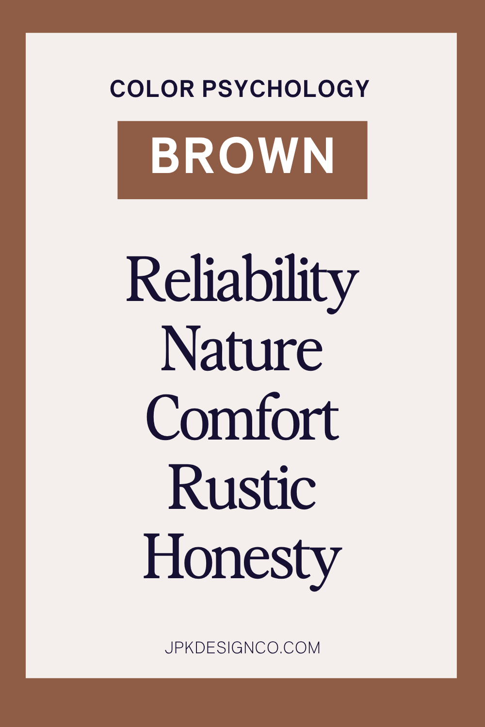
Associations: Ruggedness, dependability, earthy, reliability
Brown can be challenging to use well but is gaining popularity in light and dark tans, especially for editorial-style websites.
Brand Examples:
Hershey's
UPS
Nespresso
UGG
M&Ms
Black: The Luxury Authority Color

Associations: Sophistication, edginess, strength, luxury, authority, formality
Black grounds your design while communicating elegance and luxury. Use it thoughtfully to avoid overwhelming your layout.
Brand Examples:
Nike
Apple
Gucci
Chanel
Cartier
White: The Clean Slate Color

Associations: Freedom, simplicity, clarity, purity
White provides visual breathing room. Consider off-white tones for a softer effect. Popular with minimalist bloggers and healthcare industry websites.
Brand Examples:
Apple
Tesla
Burberry
Adidas
Nike
Gray: The Professional Color

Associations: Professionalism, calmness, stability, maturity, neutrality, sophistication
Gray provides a sleek, modern look suggesting formality and reserve. Balance it with brighter colors to maintain energy in your design.
Brand Examples:
Wikipedia
Mercedes Benz
LG
Nike
New Balance
The Bottom Line: Color Psychology in Practice
Now you know the psychology behind each color and how they can influence your visitors' emotions and actions.
Here's what to remember:
Color creates connection. When you choose colors that align with your brand personality and your audience's expectations, you create an instant sense of "this feels right."
Psychology guides, but context decides. Red might signal urgency, but if your entire website is red, nothing feels urgent anymore. Blue builds trust, but the wrong shade of blue might make your wellness brand feel cold and clinical.
Your brand comes first. The most beautiful color palette in the world won't save a website that doesn't understand its purpose or speak to its audience.
Start with your brand's personality and your audience's needs. Then use color psychology to amplify that connection.


